The year 2001 witnessed the sealing of the contract between Peking University (PKU) and Shenzhen Municipal Government to establish a graduate school of PKU in Shenzhen --- Peking University Shenzhen Graduate School (PKUSZ). It marked PKU’s explorations into a new path of managing long-distance schools and Shenzhen’s cooperation with a prestigious university with more than 120 years of history.
PKUSZ keeps the spirit of PKU and upholds the innovativeness of Shenzhen, marching forward through hardships, pushing set boundaries, and forging a wonderful, energetic southern campus of PKU at the south coast of China.
This year, Shenzhen graduate school is celebrating its 20th anniversary, for which PKUSZ made a special logo——
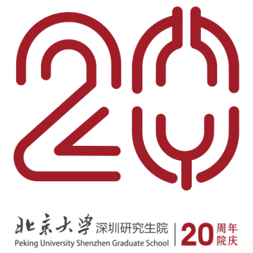
The main body of the logo is the number “20”, made of smooth and rounded lines. It incorporates both a flavor of classicality and trendy style, which demonstrates PKUSZ’s dual character of long history and modernity, and also the comprehensive, flexible mindset of its students.
The number 2” is designed based on the Chinese character “飞” (“to fly” in English), meaning that PKUSZ is in its period of vigorous growth and is constantly flying upward high above, toward a bright future. The design of the number “0” finds inspirations from the logo of PKU --- separating the two characters of “北大”(the shorthand for “北京大学”, i.e. PKU in English), with“北” as the upper part of “0” and ”大“ as the lower part. The lines are in the shape of a running track, implicating that on the path of developing science and technology, PKUSZ relentlessly pursues innovation, pushes the forefront of technology, and speeds up for pioneering explorations and achievements of scientific research.
On one hand, the logo reflects the continuation of the spirit of PKU, as a treasure house of profound culture --- its brilliant education, outstanding research, and distinctive expertise. On the other hand, it incorporates the modern spirit of Shenzhen, taking on characteristics of the new era, and presenting a school atmosphere of openness and diversity.
The logo is in red, which is the color of PKU logo and is also known as the color of China. This demonstrates that PKUSZ is part of PKU and also carries forward its honored tradition of upholding patriotism and pursuing progress, and its strong sense of responsibility of pioneering and achieving national development.
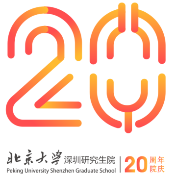
To better accommodate multiple use environments, the logo also has a different version in the bright, energetic color of orange, which indicates the constant coming in of fresh blood, bringing creativity and liveliness in PKUSZ.
The remarkable 20th anniversary marks a new start for PKUSZ, which, as an important part of the national strategy of “World-class Universities”, will continue to educate intellectuals in cutting-edge fields and cultivate a global view, steadfast patriotism and a strong sense of responsibility in them. Uphold the notion of “differentiated development for better progress of the nation”, PKUSZ will actively explore reform and innovation for development in higher education.
Translated by Wei Xiaoqiao
Edited by Andrew Fong Tsz Hei and Zhang Wendou